
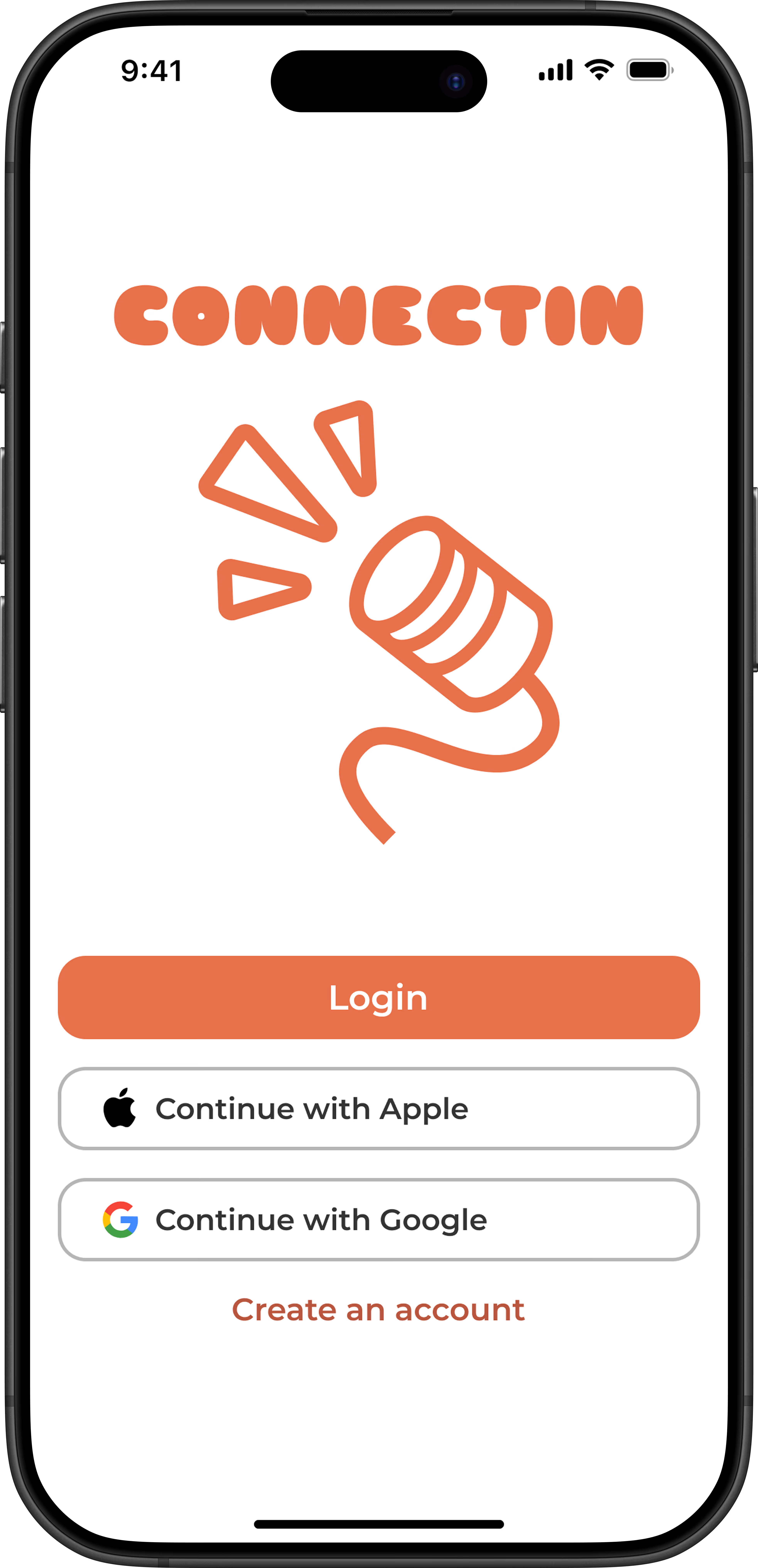
Not everyone has the means to immerse themselves in another culture, so Connectin is the next best thing. It’s an app that connects users based off a common language goal and interest. Each partner can learn from one another while connecting over shared interests. This allows the user to be actively engaged and have control over their language learning experience by personalizing it to their needs.
We presented a pitch for an app idea in my class, and afterwards we all voted on everyone's pitch. My idea was chosen, allowing me to be the team leader for this project, and bringing Connectin to life.
Role
Team lead, UI design, Prototyping, Research
Approach & Timeline
Goal-Directed Design (September - December 2025)
Tools
Figma, FigJam, Microsoft Teams
We used an approach called Goal-Directed Design, a method focused on helping users achieve their goals.
To do this, we researched the context of language apps, imagined hypothetical stakeholder business goals, interviewed 5 participants about their pain points with language apps, synthesized research into personas, put those personas in a context scenario to deriving requirements, wireframed by imagining how personas would use the app, brought the wireframes to life in Figma, and completes usability with 2 participants for some limited feedback. (To see the complete process, visit our FigJam white board page.)
Follow along to see the problems we identified, how we aimed to solve it, along with the lessons I learned throughout this experience.
It is difficult to find language-learning partners that speak your target language.
Popular language learning apps prioritize building foundational skills (i.e. vocab & grammar), but lack the tools needed to build fluid conversational skills in a foreign language.
Talking in a foreign language or to native speakers can be intimidating, turning people away from even trying.
An issue we noticed with competitors is how the user is thrown into finding their ideal partner by scrolling through an endless contact list to choose from. That list layout presents to the user the excessive list of options they have and is visually overwhelming.
I designed a key feature that is the Connect tab. It is inspired by the format of dating apps, where you swipe left or right depending on whether you'd like to connect with that person or not.
Creating one person's card to take up the entire screen allows the user to focus on the option presented to them in that moment.
The match cards are simplified to bring clarity to the essential information needed for selecting a partner:
These features allow for an effortless process in connecting with your ideal language exchange partner amidst the daily demands of life.
Conversational skills learned through traditional apps like Duolingo and traditional classroom settings are structured, unable to replicate the rawness of real conversations.
Based off our interviewees, conversational preferences ranged from asynchronous/text-based conversation to live conversations. Some were busier than others, which explained why they prefered apps like Duolingo versus talking apps.
We kept this in mind by allowing the user to select and display their communication preferences and commitment levels that shows to other users. This helps users to be aware of potential matches and their preferences so expectations are set before they even match.
Chat is where the user can view their matches, and of those who they have started chatting with. The user is able to text, audio/video call, and send voice recordings just how they would with commonly used messaging apps. They have access to a calendar where they schedule time to talk with their partners.
This creates accountability where needed, and meets the user at their level of comfort.
There is a lot to think about when having a conversation with someone new, especially when it's in a foreign language.
All our interviewees had some level of fear of embarrassment or making mistakes, making it intimidating to practice a foreign language with someone who is more fluent than you.
Here are a few ways Connectin aims to ease that intimidation:
As this was my first time being a team leader and managing a group semester-long-project, I learned a lot, but here's what stuck out the most:

