
Have you ever been to an art exhibit and taken a picture of a piece you love, just for it to get lost in your camera roll & never be seen again?
Monet has over 250 paintings in his Water Lilies series. I’ve seen a few, but I couldn’t tell you which ones. Standing in front of one of these for the umpteenth time, I told my friend, “It would be nice to remember which one of his paintings I’ve seen.” She agreed and told me her struggles with remembering any of the art she sees.
These struggles inspired the creation of Easel, a mobile app to help you discover and organize the art you love.
Role
Team lead, UI design, Prototyping, Research
Approach & Timeline
Lean UX (February - April 2025)
Tools
Figma, FigJam, Microsoft Teams, Microsoft Forms
Easel was class project for an interaction design class, based on an idea I pitched and voted on by my classmates. I had a team of four and together we built Easel. As team lead, I was involved in mostly everything. I moderated interviews/meetings, designed features like search and journals, and oversaw the progress of the project.
Follow along to see the problems we identified, how we aimed to solve it, along with the lessons I learned throughout this experience.
Services like Pinterest tend to lose the origins and details of the artwork. Users can save the artwork but not have any details needed to learn more about the artwork and the artist.
No designated tool for users to organize and keep track of art, mediums, and artists.
It's difficult to discover local art, events, and exhibits and is more of an “if you know you know” situation.
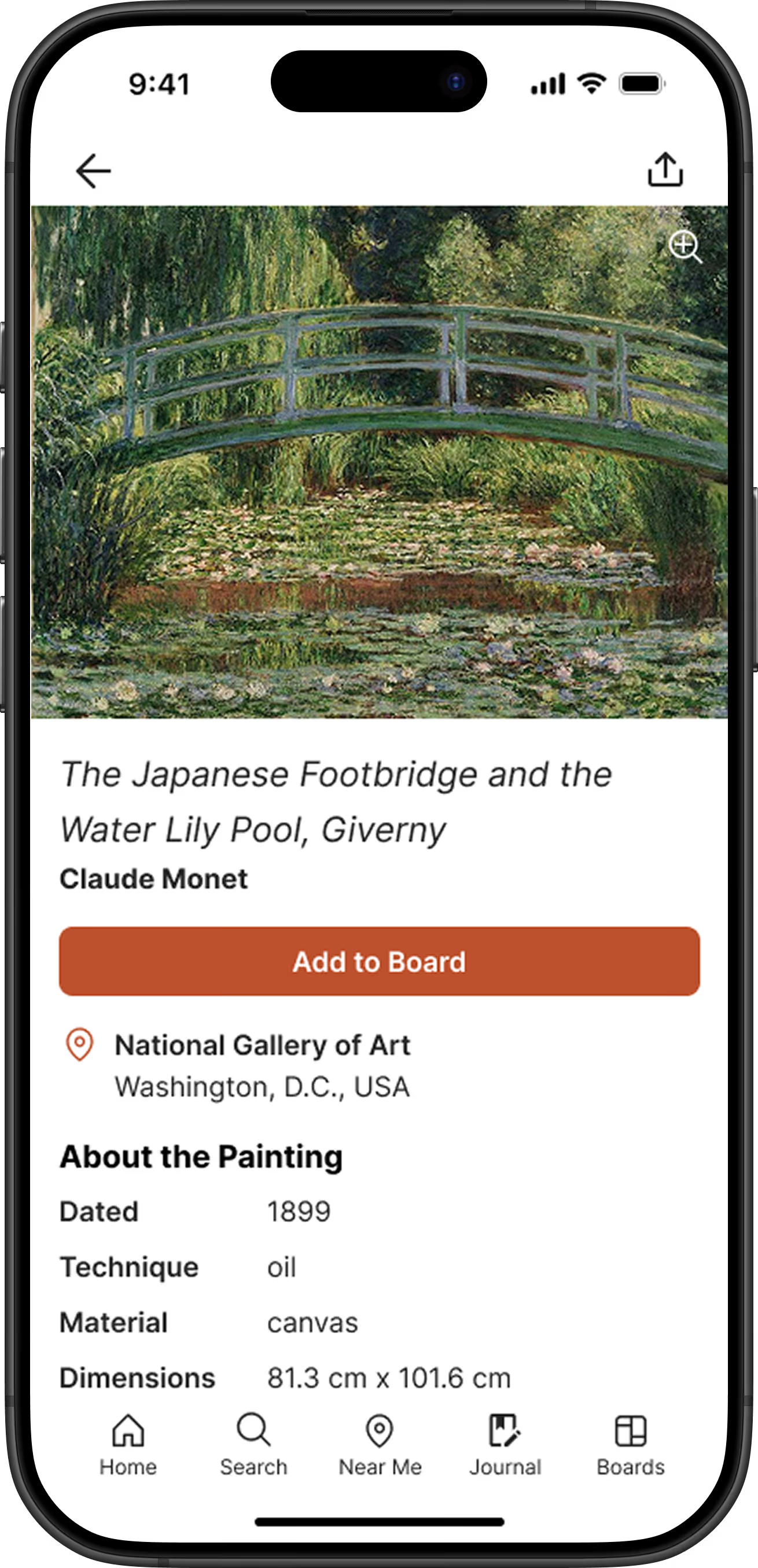
The home page is a gallery that shows the user a feed of artworks. When they click a piece, they can:
Multiple interviewees mentioned that they valued learning about the backstory of a piece of work as much as they did viewing the piece itself.
For whatever reason a user may want to keep track of an art piece, they can "Add to board", which is very similar to Pinterest. These boards are customizable, so that they can organize by favorites, must see, inspiration, or however they please.
With Easel, everything is in a dedicated space so that there's no need to keep mental track of it all.
Of our interviewees who did keep track of the artwork they've seen, they all mentioned that their system was ineffective.
Journals is meant to keep the user's notes and photos they took together, providing a space to track specific details and experiences that may be helpful to the user in their own creative journey.
I designed this to feel like writing a journal entry; tracking details like the date and location, anything you may want to mention, and photos you took. Journals are whatever the user wants them to be. They can be made private or public for their followers to see. Whether you're keeping track of the pieces you enjoyed at a museum or exhibit, or even your thoughts of one specific piece, it's made to be what helps you remember.
Tags were added to help users filter through journals when looking back at them. Let's say when revisiting a museum, the user maybe made note of the paintings they didn't get to see or would love to see.
Whether the user wants to learn more or has something specific they're looking for, they can use "Search".
I designed this with inspiration from Spotify's search tab. Music is just as broad as visual artwork, and Spotify helps you discover music by breaking it down into categories. Keeping in mind how broad art is; it was important to add visuals with the titles to give the user a visual idea of what that specific category is about.
Once a section is selected, the user is given a breakdown that consists of:
This aids the user in discovering more about an interest while organizing their discovery as they gather inspiration.
Spotify makes it easy for the user to learn about the artist. When you click on an artist's page, you can learn about their discography, the artist, and where they're performing.
Considering interviewees' value of learning backstories and finding art near them, it was important to me to incorporate this design into Easel. Doing so allows users to learn about an artist, see their body of work, and where their art is displayed for effortless discovery.
Art can only be consumed virtually for so long. Interviewees mentioned wanting a way to discover local art, as Instagram or word of mouth was their only way to discover.
"Near Me" is broken into two categories to give the user information to engage with the art physically near them.
Even though this was my second time being team leader, I still and will always have something to learn. Such as:

